Composition
Composition Armatures: The Hidden Geometry Behind Strong Paintings and Photographs
The best compositions feel effortless — which is exactly why they're so easy to miss. Underneath almost every picture that "just works" is a quiet skeleton of lines nobody's meant to notice. This is a plain-English tour of that skeleton: what composition armatures actually are, where the famous ones came from, and how to put them to work in your own paintings and photos.
What is a composition armature?
In sculpture, an armature is the wire skeleton buried inside the clay — you never see it in the finished piece, but it's the thing holding everything up. Composition borrows the word for the same idea. A composition armature is the structure of lines underneath a picture: where the focal point lands, how your eye travels, how the big shapes balance each other out. Nobody looking at the picture sees it. They just feel it working.
And here's the part that's easy to forget: you never actually start from a blank slate. The second you pick a canvas, you've already got four lines to deal with — the edges of the box. Everything you drop inside plays off those edges whether you meant it to or not. An armature just hands you a few more lines to work with: a diagonal here, a division there, a handful of intersections that give you somewhere deliberate to park the stuff that matters most. Land your strongest elements on those lines and crossings, and the picture tends to click.
And when it clicks, most people can't tell you why — that's the whole point. Good composition tends to vanish; people just feel that a picture works and move on, never clocking the scaffolding holding it together. The artist is the one who gets to see behind the curtain. That's the inside track this whole piece is about.
The rule of thirds: the gateway grid
If you've touched a camera in the last twenty years, you already know this one. Split the frame into three equal columns and three equal rows — two vertical lines, two horizontal, four intersection points — then put your key elements along the lines and your focal point on one of the crossings instead of dead-center.
Think of it as the easygoing cousin of the older, stricter systems. Its whole virtue is speed: it's rough, it fits any rectangle instantly, and it breaks beginners of the habit of centering everything. Its weakness is the same thing — it completely ignores the actual proportions of your frame. Those lines land at 1/3 and 2/3 whether you're shooting a square, a tall portrait, or a wide panorama. Perfect for a quick gut-check; less so when proportion really matters, which is exactly why the fussier systems below exist.
Read the full deep dive on the rule of thirds →
The golden triangle: composition for diagonals
The rule of thirds is happiest with upright, level subjects. The golden triangle is the diagonal cousin, and it shines when your picture has a strong diagonal running through it — a road slicing across a landscape, a reclining figure, a gesture that cuts corner to corner.
Building it is easy. Run one diagonal corner to corner. Then, from each of the other two corners, drop a line that hits that diagonal at a right angle. Now you've got the main diagonal plus two shorter perpendiculars, carving the frame into a set of interlocking right triangles. Lay your subject along the diagonal and drop your accents where the perpendiculars strike it.
Because it's built from perpendiculars rather than a fixed ratio, it adapts cleanly to any aspect ratio, and it comes in four orientations (the diagonal can start from any corner) plus mirror versions. You'll see it discussed far less than thirds or the golden section — which is half its charm. It gives you an aggressively dynamic flow that doesn't look like everyone else's shot.
Read the full deep dive on the golden triangle →
Dynamic symmetry: the serious system
This is where composition gets genuinely deep — and, not for nothing, where this app got its name.
Dynamic symmetry is a proportioning system named and championed by Jay Hambidge (1867–1924), a Canadian-born artist and theorist. After measuring a great many Greek vases and the Parthenon, Hambidge became convinced that the beauty of classical Greek design came from the deliberate use of what he called root rectangles — rectangles whose sides sit in irrational ratios: √2, √3, √4, √5, and the golden ratio (φ ≈ 1.618). He wrote it all up in Dynamic Symmetry: The Greek Vase (1920) and The Elements of Dynamic Symmetry, and the idea caught fire in American art schools through the 1920s and '30s — turning up in studio curricula and even department-store window displays.
At the center of it all is the reciprocal rectangle. Draw a diagonal across your frame, then drop a perpendicular onto it from one of the opposite corners. That carves off a smaller rectangle that's the exact same shape as the original, just rotated and shrunk — its reciprocal. In a root rectangle, that one ratio keeps repeating no matter how far down you subdivide, spinning out a lattice of diagonals and crossings that all relate back to each other. As Matila Ghyka described it, Hambidge's rectangles generate a remarkable variety of harmonious subdivisions from a dead-simple move: draw a diagonal, drop its perpendicular, then run whatever parallels and perpendiculars you like off the sides and diagonals.
Unlike the rule of thirds, dynamic symmetry's placement points come straight out of the proportions of your actual rectangle — which is exactly why it's both more powerful and more of a handful. Photographers rediscovered it over the last few decades for that reason: it's a proportion-aware answer to the one-size-fits-all thirds grid.
Read the full deep dive on dynamic symmetry →
The golden ratio and the Fibonacci spiral
The golden ratio is the most famous idea in this whole toolkit, and one of the most satisfying to actually compose with.
The math is genuinely lovely. The golden ratio, φ (about 1.618), describes a split where the whole relates to the bigger part the same way the bigger part relates to the smaller. A golden rectangle has its sides in that ratio — and here's the neat trick: slice the biggest square off one end and what's left is another, smaller golden rectangle. Forever. Inscribe a quarter-circle in each of those nested squares and you get an approximation of the golden spiral — the curve you've seen laid over everything from nautilus shells to galaxies.
As a composition tool, it genuinely earns its keep. Drop a focal point at the spiral's tight "eye," or run a subject along the curve, and you get a natural, inward-pulling flow. Plenty of artists compose with it on purpose and to great effect.
Read the full deep dive on the golden ratio & spiral →
Other armatures worth knowing
The four grids above are the app's bread and butter, but artists reach for a much bigger vocabulary of structural shapes. A few you'll run into, quickly:
- The S-curve. A wandering line — a river, a path, a road — that walks the eye from the foreground back into the distance. Landscape painters are obsessed with it. Neat trick: let the curve fade out before it hits an edge, so the eye gets carried in instead of wandering straight back out of the frame.
- The cruciform. A cross — an offshoot of the plain horizontal/vertical armature — where a dominant vertical and horizontal lock together. Nothing says it has to be centered.
- The fulcrum. Masses balanced like weights on a seesaw: one big, quiet shape offset by a smaller, louder one. That "weight" can come from size, value, saturation, or color temperature.
- The "O" or radial armature. Elements circling a central focal point, walking the eye around and back inward.
- The medallion, or armature of the circle. For round (tondo) work: split a circle into eight and connect the points to structure the space. It comes straight down from Gothic rose windows and medieval manuscript illumination.
S-curve
Cruciform
Fulcrum
Radial / “O”
Medallion
Most real paintings run several of these at once. The goal is never to jam a picture onto a template — it's to arrange things naturally while quietly leaning on structure to steer the viewer, without the whole thing feeling gimmicky or over-engineered.
How to actually use armatures in your own work
Theory's cheap. Here's the loop that actually works:
- Analyze finished work first. The fastest way to see armatures is to lay them over pictures you already like — starting with your own. Take the pieces that sold, won something, or just feel resolved, and drop grids on them. More often than not you'll find your best work already sits on an armature you picked by pure instinct. Seeing that consciously is what lets you do it on purpose next time.
- Pick the structure that fits the subject, not the other way around. Diagonal subject → golden triangle. Horizon-and-vertical landscape → thirds or rabatment. Something with a strong inward pull → the spiral. A proportion-critical studio setup → the matching root rectangle.
- Compose to the armature on purpose in a rough sketch — put the focal point on an intersection, line a major edge up with a diagonal — then let the reference bend to your composition instead of copying it slavishly.
- Don't over-obey. The armature's a guide, not a cage. A lot of the best compositions come from playing the structure and a deliberate break against each other.
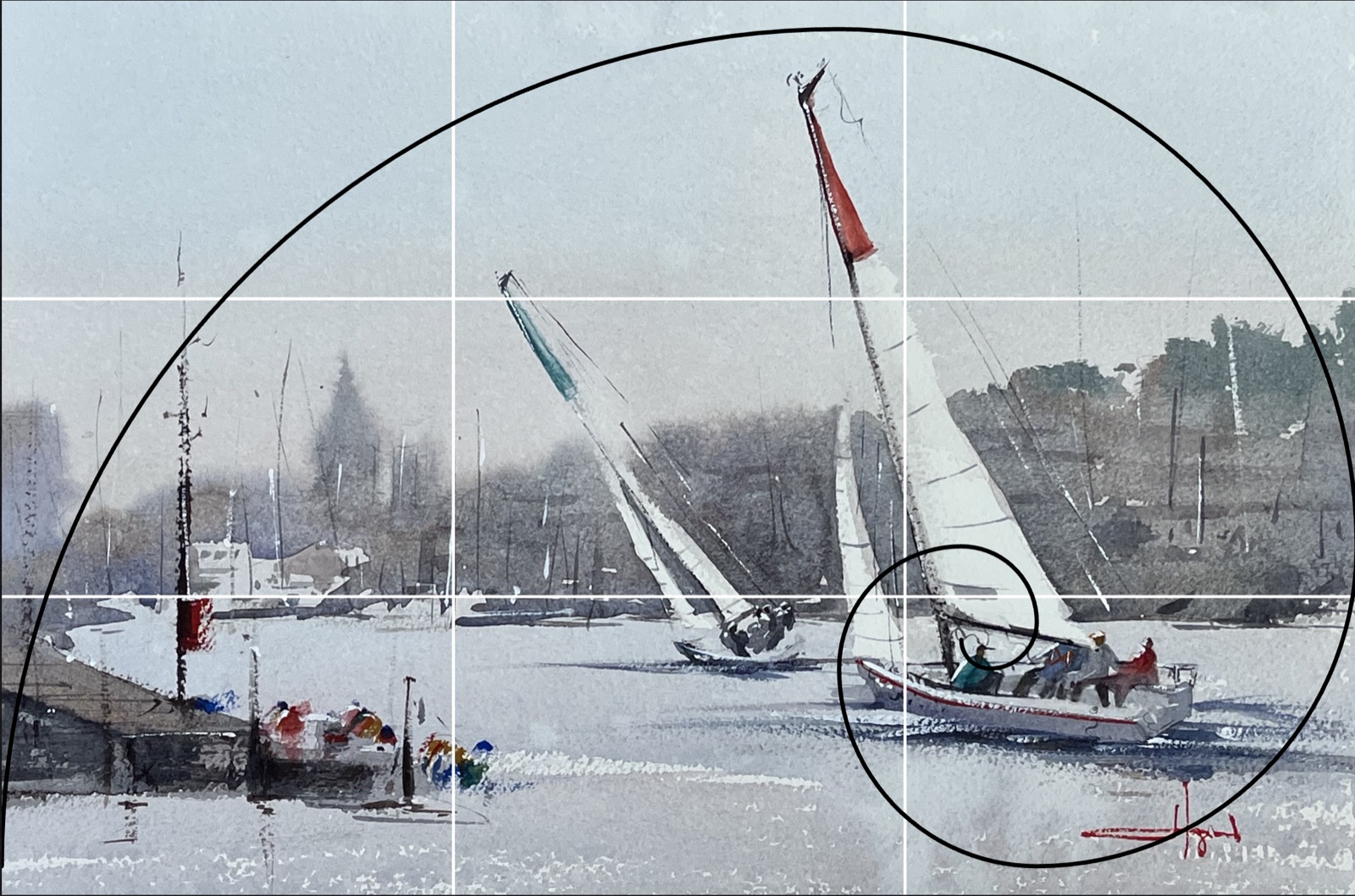
That analyze-overlay-compose loop is exactly what this tool is for: upload a painting or photo, drop one or more armatures on top, flip and rotate them to fit, and actually see the geometry you're working with.
Try it on your own work
Upload a painting or photo and drop any of these armatures on it in seconds — free, right in your browser.
Open Composition Armatures →Further reading
- Jay Hambidge, The Elements of Dynamic Symmetry (1920) — the foundational text, free to read on the Internet Archive.
- Charles Bouleau, The Painter's Secret Geometry — a survey of compositional geometry across 500 years of Western painting.
- Mario Livio, The Golden Ratio — a mathematician's accessible history of φ, from the math itself to its long career in nature and art.